Minimalist chibi: the complete guide
Minimalism in chibi is not "less detail". It is a decision about which single feature carries the character — and then refusing to add anything else.

The rule of one accent
A minimalist chibi has exactly one feature doing the identifying work: a colour, a hair shape, an accessory, or a pose. Everything else is reduced to the fewest marks that still describe a body. When an image in this register feels weak, the cause is almost never a missing detail — it is that two or three details are competing for the same job.
Shape language does the heavy lifting
Since there is almost no interior detail, the outline has to be distinctive. That means committing to one shape family: all circles, all soft squares, or all pointed triangles. Mix two and the figure becomes generic. A character built entirely from circles reads as round and gentle; the same proportions built from triangles reads as sharp and quick.
Why it is the best icon style — and the hardest
It is the best because it survives any size: a two-mark chibi is still readable at 24 pixels, where everything else turns to noise. It is the hardest because there is nowhere to hide. Every unnecessary line is visible as clutter, and a wobbly curve has no rendering to disguise it. Most people find that removing marks is much harder than adding them.
Practical settings
Use a limited palette — three colours plus one accent — and one line weight. Keep a generous margin of empty space around the figure; minimalism reads as intentional only when there is enough room for the emptiness to be visible. If you are generating, a clean minimal preset will honour the accent rule far more reliably than a written prompt describing restraint.
Presets in this style family
Each tile opens that preset's page.

Live Stream Ui Mockup
Minimalist chibi: the complete guide →
Photoreal Portrait Grid
Minimalist chibi: the complete guide →
Basketball Selfie Brand
Minimalist chibi: the complete guide →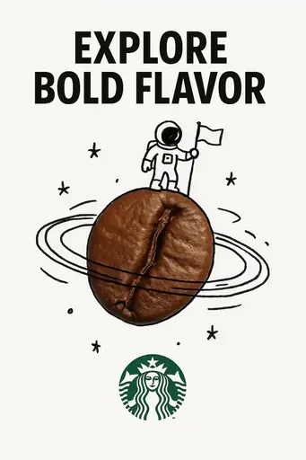
Creative Ad Real Object Hand Drawn Doodle
Minimalist chibi: the complete guide →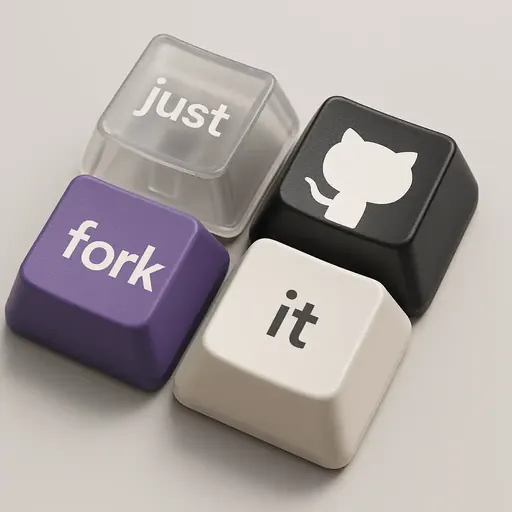
Branded Keyboard Keycaps
Minimalist chibi: the complete guide →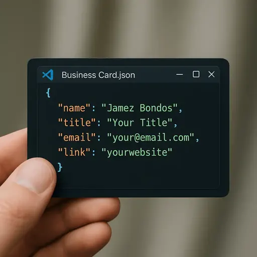
Code-Styled Business Card
Minimalist chibi: the complete guide →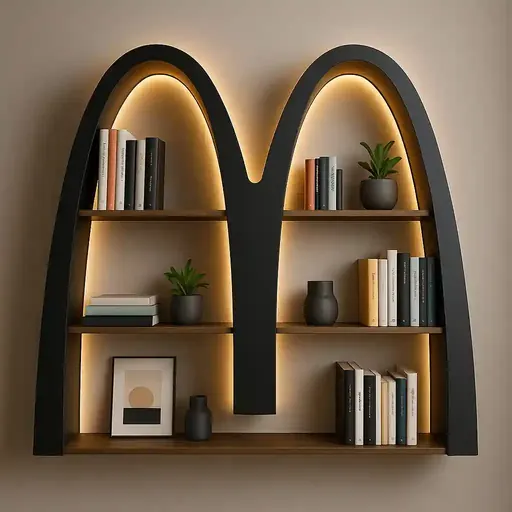
Logo-Shaped Creative Bookshelf
Minimalist chibi: the complete guide →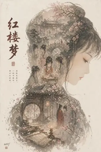
Epic Profile Silhouette Fill Poster
Minimalist chibi: the complete guide →Where to go next
Read next
About this guide
This guide is editorial content written by the ChibiArts team. ChibiArts is not affiliated with, endorsed by or sponsored by any of the studios, brands or trademark owners named on this page — those names are used descriptively, to compare visual styles.
Frequently asked questions
Is minimalist chibi just a rough sketch?
No. A sketch is unfinished; minimalism is finished but reduced. The difference is that every mark in a minimalist piece is deliberate.
What is the best use for it?
App icons, favicons, logo marks, small stickers and single-colour printing — anywhere the image will be reproduced small or in one ink.
How many colours can a minimalist chibi have?
Three plus an accent is a good ceiling. Past that, the colour stops reading as a deliberate choice and starts reading as a palette.