Watercolor chibi: the complete guide
The softest of the chibi registers, and the one that depends most on its edges — the place where the paint stops is the whole style.
What makes it watercolor
Four cues, and all four have to be present or the image reads as a soft digital painting instead. Washes — large areas of colour with visibly uneven density, darker where the paint pooled. Soft edges — most boundaries bleed rather than stop, with a few hard edges kept deliberately as accents. Paper grain — a texture showing through the lighter areas. Palette discipline — a limited set of pigments that mix into each other, so the greens and browns share a family.
How the proportions change
Watercolor pushes toward 3 to 3.5 heads rather than the extreme icon ratio, because the medium's softness needs a little more room. A 2-head figure in watercolor tends to dissolve into a coloured blob — the features are too few and the edges too soft to hold the shape.
Where it shines and where it fails
It shines at poster and print size, with a background painted with as much attention as the figure — foliage, sky, an interior. It also suits gifts and memorial portraits, where the softness reads as tenderness rather than as a lack of definition. It fails when it is shrunk: below about 128 pixels the washes average into flat colour and the paper grain disappears, leaving a muddier version of a simpler style.
Practical settings
Render large — 1024 pixels and above — and downscale only if you must. Keep the composition loose: watercolor rewards empty space, and a crowded layout removes the white paper that is doing a large share of the work. If the output looks too clean and digital, the missing cue is almost always the pool line where a wash dried at its edge.
Presets in this style family
Each tile opens that preset's page.
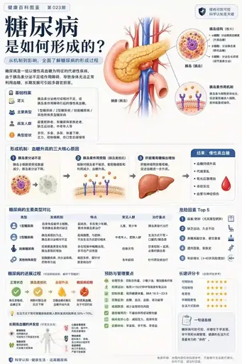
Popular Science Encyclopedia Chart
Watercolor chibi: the complete guide →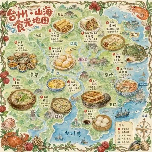
Handdrawn Taizhou Food Map
Watercolor chibi: the complete guide →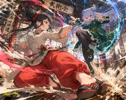
Anime Art Creation
Watercolor chibi: the complete guide →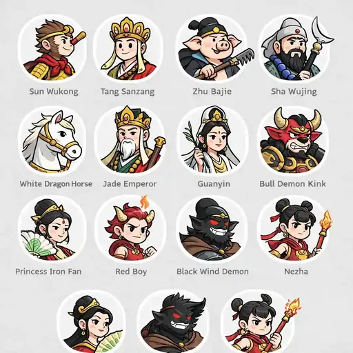
Journey West Avatar Grid
Watercolor chibi: the complete guide →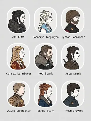
Got 3x3 Portrait Grid
Watercolor chibi: the complete guide →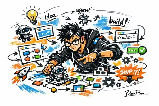
Graffiti Sketch Ai Builder
Watercolor chibi: the complete guide →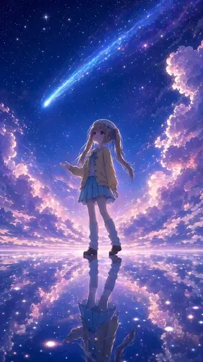
Illustration Art Creation
Watercolor chibi: the complete guide →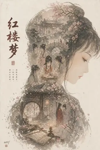
Epic Profile Silhouette Fill Poster
Watercolor chibi: the complete guide →About this guide
This guide is editorial content written by the ChibiArts team. ChibiArts is not affiliated with, endorsed by or sponsored by any of the studios, brands or trademark owners named on this page — those names are used descriptively, to compare visual styles.
Frequently asked questions
Is watercolor chibi good for stickers?
Not ideal. Sticker sizes are small, and the soft washes average out. A flat or line-based chibi reads better at that scale.
What paper texture should the image show?
A cold-press look — visible, slightly irregular grain — works better than smooth hot-press, because the texture is what signals the medium at a glance.
Can I turn a photo into a watercolor chibi?
Yes. Keep a simple, well-lit source photo; the softer the source lighting, the more convincing the wash treatment, because the mid-tones the medium needs are already there.